How to make your web pages text-reader friendly
Pictures on websites look great, don’t they? But only if people can see them! Not everyone has broadband access; some people still have (very slow) modems. Others use a text-based browser, or a text reader that reads out the web page to them – or simply do not have the time to wait while pictures download and appear on their screen.
Fortunately, it’s possible to accommodate each of these scenarios by making sure that people know what the picture is, and what clicking on it does (if anything), without having to see the picture at all. Click on the picture in your web page editor, right-click and choose Properties. Then, in the box labelled Text, enter a description of the picture.
Even where speed or sight is not an issue, you can still make people’s experience of your website more enjoyable by including descriptions of your links – before people click on them. It’s rather frustrating to have to click on a link in order to find out where it leads. You may think it’s obvious from the text of the link, but that’s not always true. You can make your web pages much nicer to use by providing descriptions for the text links as well as the graphics.
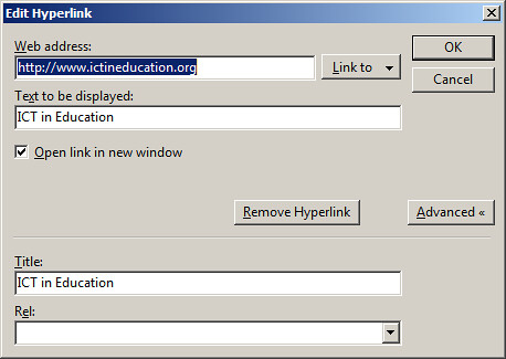
 Use Title text to make your links more user-friendlyYou can do this by using the Title text option. As you can see in the screenshots, I have made the ICT in Education website link quite user-friendly: when you hover the mouse pointer over it, you see the text “ICT in Education website”, as shown below:
 This is how the Title text appears on the finished page
I did this in the following way:
First, the text I chose to turn into a link makes sense in itself. In my opinion it’s a big mistake to use words like “Click here”, because they don’t make any objective sense. Furthermore, if a visitor is using a text reader (software which reads out what’s on the page”, the word “here” means nothing.
Second, I used the Title text box to describe the link. (You can usually create both the link and the Title text by selecting the word or phrase to be used as the linkable text and then pressing Ctrl and K.) Again, I used a proper description, not something vague like “useful website” (even though it is!).
There are still some software and web editors that don’t have the Title text box option appear automatically when you create a web link. I think this is quite disgraceful in this day and age, and makes it that much harder to meet the requirements of the Disability Discrimination Act in the UK. If you’re faced with that situation, you will need to go into the HTML Editor and edit the link so that it looks something like this:
<a title="ICT in Education website" href="http://www.ictineducation.org/" target="_blank">ICT in Education website</a>
As you have probably guessed, the magenta-coloured text provides the title text. Incidentally, the target=”_blank” text indicates that the website linked to will open in a new browser window. If you have the option to do this I should recommend it, for two reasons:
First, it means that the reader can always get back to the original page very easily rather than trying to backtrack their way to it. Second, it means that your web page remains open, making it more likely that they will return to it and carry on reading.
Getting back to the text-reader friendly links theme, I think that if you do as much as you can to make your web pages friendly and useful for sight-impaired people, they are likely to be so for everybody.